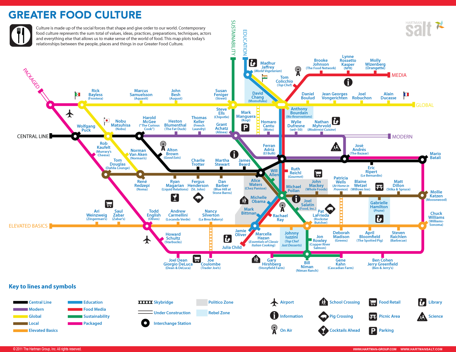
"Bringing food culture to life," HartmanSalt has created a nifty little infographic explaining their perspective on the current connections within food and beverage culture. Modeled after the London Underground system, with different "lines" representing the different forces shaping contemporary food culture: sustainable, local, modern, education. In the layout of their routes, the "lines" also seem to track data like a graph - but maybe that's just me. Not just a stunning visual representation, HartmanSalt highlights the individuals, ideas and trends which are shaping our world. In their own words, the map is "a snapshot of the main actors, techniques, values and ideas representing today’s culinary zeitgeist."

While the map itself is cool, the interactive version is way better, offering tons of information at every "stop"!
Image Sources:


